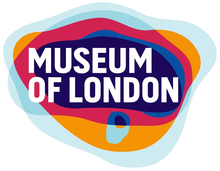
One of my recent tweets received over 25,000 impressions (views on peoples’ feeds) in the first 48 hours, which is astonishing and wonderful. Why did this happen, and what can be learned from it?
For Londonites: #DidYouKnow the colourful @MuseumofLondon logo is the city limits at various times?? https://t.co/7jm2CGO2Bu pic.twitter.com/4EVeCmuEiv
— Sarah J. McCabe (@Sarah_McCabe_) October 19, 2017
In creating my own website I’ve been thinking about personal branding and logos, which has set me on a hunt for outstanding examples. While learning about design principles and colour psychology (subjects for another post), I’ve discovered something amazing about an image familiar to me and millions of people.
The attractive Museum of London logo has a hidden meaning!
Well, not hidden, perhaps, as much as un(der)known, to me at least. The Museum of London has played a major role in my experience of the city, since my first visit in 1994. While at school in London from 2011 to 2013, I enjoyed numerous classes and events there. Speaking with curators, and research in the Museum’s collections and archives, were crucial for my MA dissertation. I’ve seen the new logo, launched in 2009, countless times.
So I was genuinely thrilled to learn that the image is composed of the outlines of the city from Roman times onwards. It was such a surprise and a pleasure to stumble upon the meaning that I had to share it.
My tweet received an extraordinary (for me) amount of views, retweets, likes, and comments. Here are six reasons why I suspect that was.
1. The tweet contained a colourful eye-catching image. Personal experience shows that tweets with images or infographics receive more retweets and likes. (Statistics show this too, though I’m not finding sources authoritative enough to share.)
2. I began the tweet by addressing an intended audience, with the text “For Londonites,” which caught people’s attention (“Londonites” referring not just to London residents, but to any of us with an interest).
3. The tweet contained a question (“did you know?”), which encouraged a response. My favourite feedback has to be this from a Yeoman Warder at the Tower of London.
Well I never, Thank You #Trivia #GoodToKnow
— Dave Phillips (@BeefeaterDave) October 20, 2017
4. My intentions in sharing the information were authentic, and the voice was my own. I wasn’t selling anything, or seeking the spotlight. Just being a bit goofy excited.
5. I notified other London-obsessed friends I thought would get a kick out of it, including Matt Brown, author of “Everything You Know About London is Wrong” (2016), and Mark Mason, author of “Question Time: A Journey Round Britain’s Quizzes” (2017). They shared the tweet, which amplified its reach.
This is beautiful. Had no idea. https://t.co/sdXAS7cxHb
— Mark Mason (@WalkTheLinesLDN) October 19, 2017
6. Including a link to further reading added value to the tweet. As a responsible infopro (!), I was concerned that the creator of the image be credited. Thus I included a link to London brand design agency Coley Porter Bell’s case study on their design of a new logo for the Museum of London, which they do in fact encourage you to share.
After tweeting gently for six years, I’m gratified that this particular tweet, sharing something truly amazing to me, has achieved the reach that it has. Thanks to all who’ve read, liked, retweeted, and/or commented upon this London trivia tidbit (and example of glorious branding design), and here’s to finding more good stuff for you!
If you found this post interesting, feel free to share it.

